30.01.2018

It is possible to list all primary colors with their characteristics, like red stands for warmth and alert us. Blue stands for chill and calmness. And so on. But let summarize all colors in two areas: cold and warm.
The spectrum from green to blue conveys a feeling of tranquility, calmness but also for distance. The spectrum from yellow to red create a warm feeling, passion and feeling of security but also here: these colors warn us.
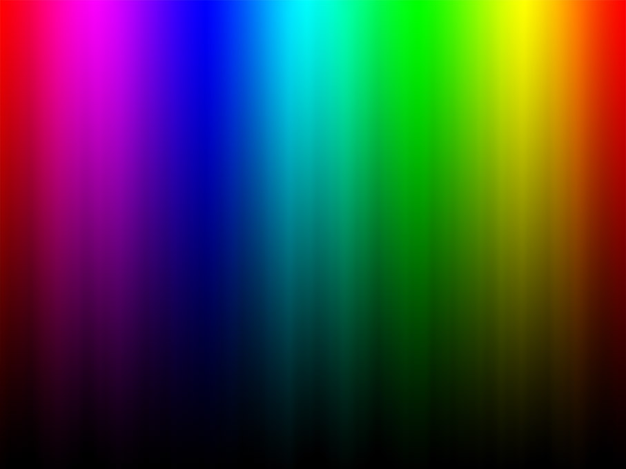 Color Spectrum
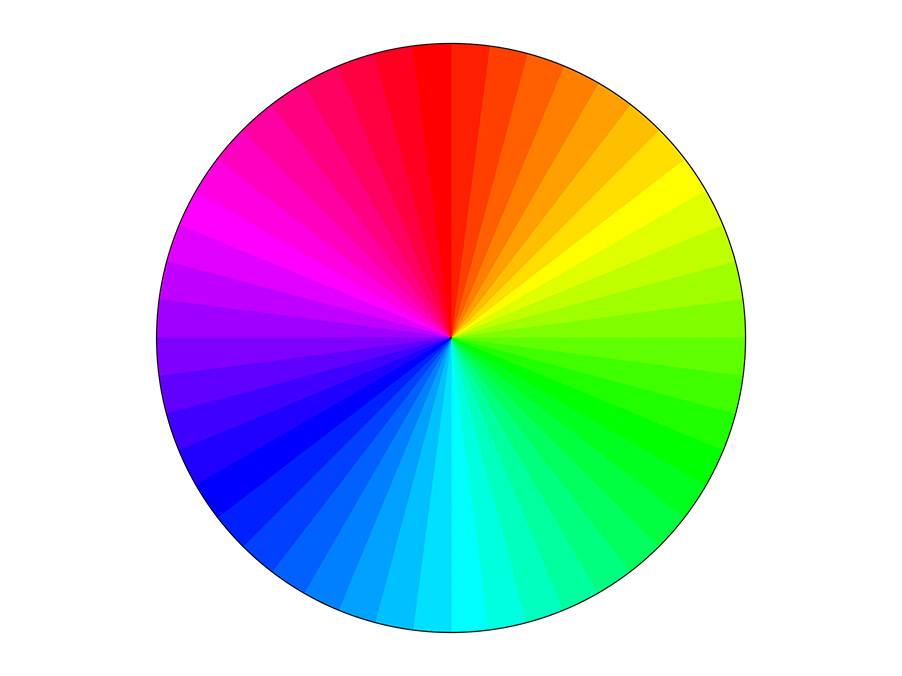 Color Wheel
When it comes to color as mean of design
Please don't think the more colors a photo offers, the better it is. As in most cases, the opposite is true: less is more and the combination is what matters. One combination would be complimentary colors: these are color pairs which are opposite each other in a color circle. For example blues and yellows (orange). If you mix two complementary colours with a 50 % content each, you get a neutral grey.
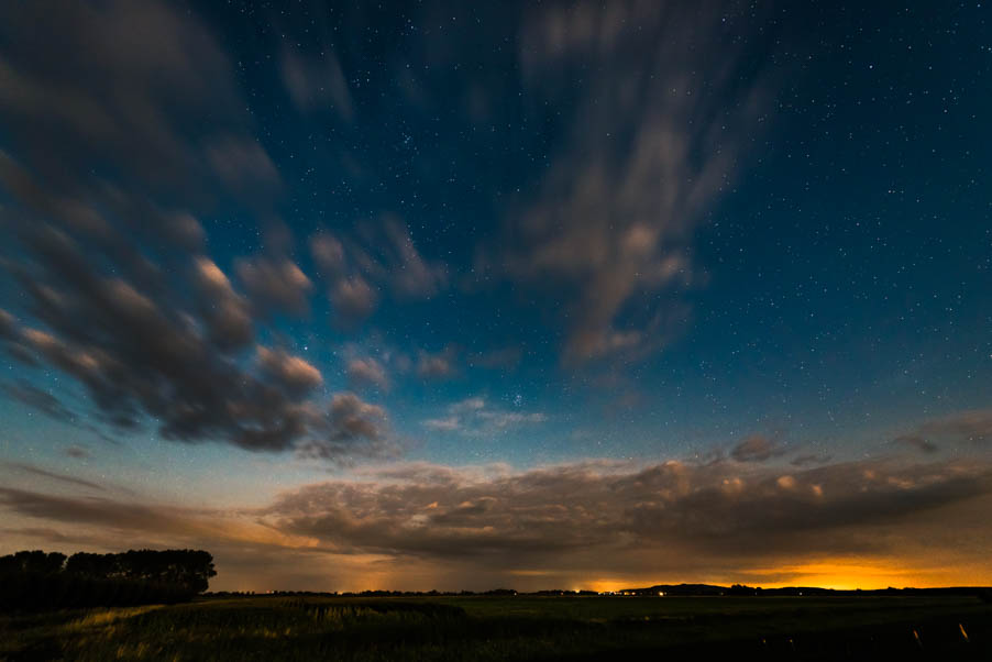 In this example the yellow takes only a small part of the image and this is the key.
The more intense color, in this case yellow, should only make up a quarter of the picture. Otherwise the harmony would get lost.
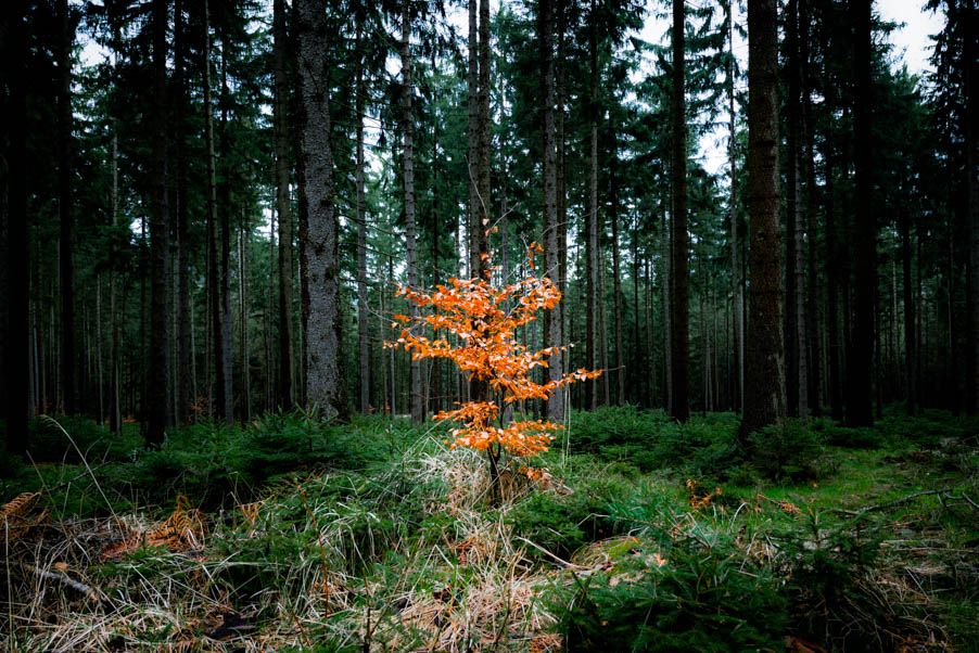 The same here: green and red tones are opposite each other and working fine in this picture.
Another approach would be the use of analogous colors. In the area of colors means that colors that are next to each other in the color spectrum.
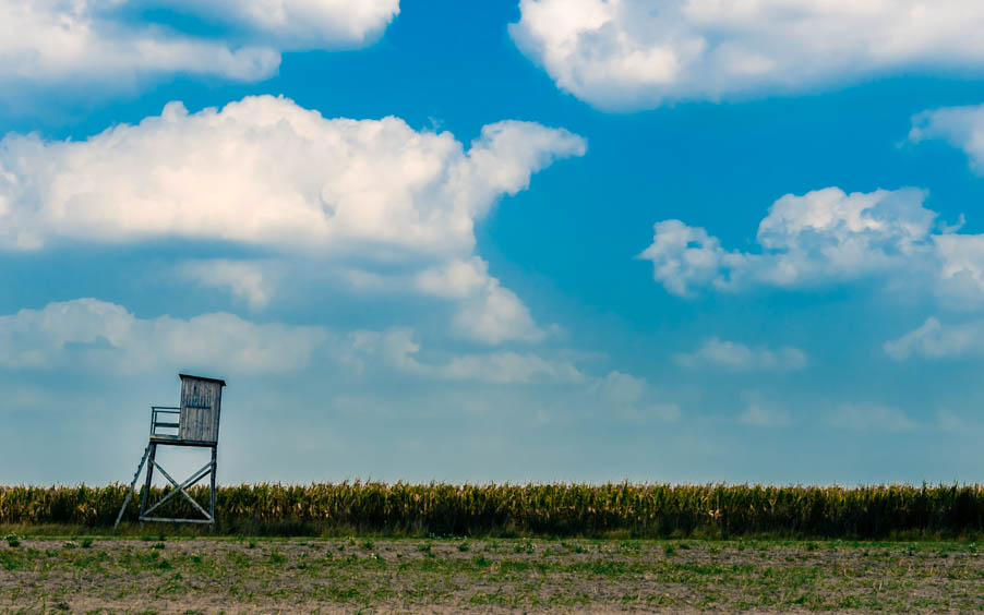 In this example green and blue tones work well together.
And you see the simplicity, two dominant colors over the whole image. That leaves also an impression on the viewer. Another example for analogous colors:
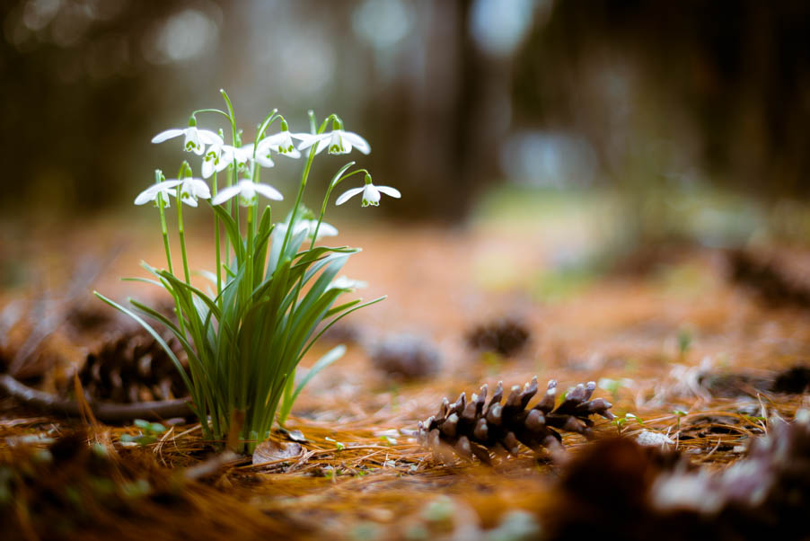 The snowdrop has the perfect stage: the browns (dirty red tones), work fantastic with the green leaves of the flower.
A third way to design the photo by color would be to choose a monochromatic color. In this case is only one color dominant, in all its saturation levels and hues. The challenge by this is that the photo isn’t becoming boring.
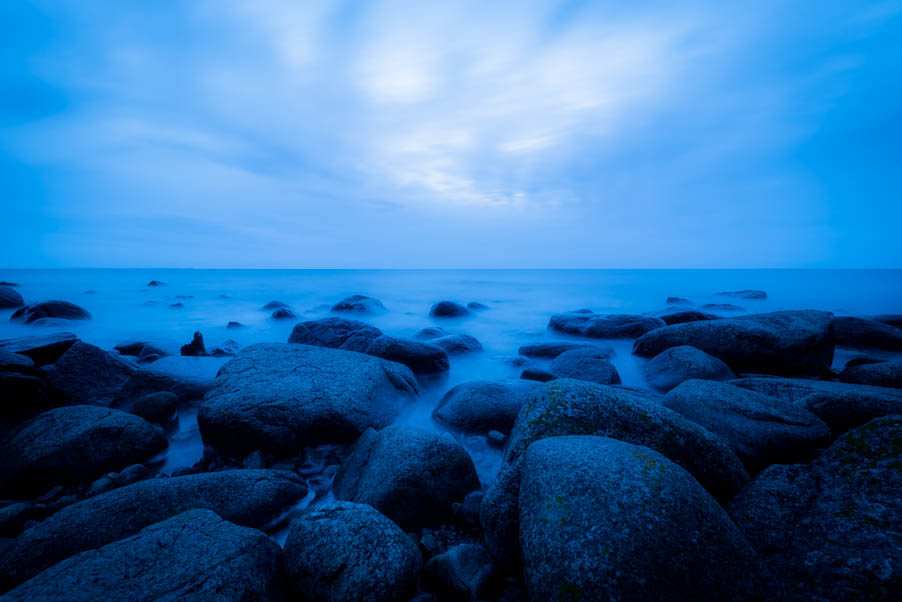 Blue hour at the beach.
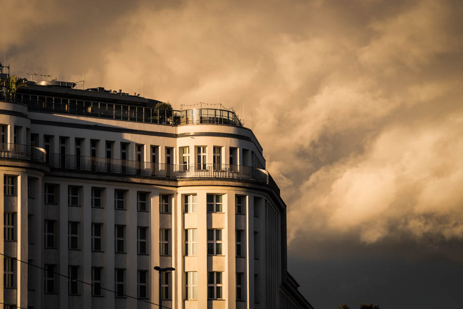 A descent yellow is dominating this picture.
White
White makes a picture alive. If you turn the whites in your photo editing software up, the lights will be more present and that means the pictures get more aliveness. If you turn it down the photo becomes blunt. It’s getting boring. So white is very important when it comes to the treatment of light. And it helps the colours to shine more brightly, regardless of the surrounding colours. Keyword: luminance of color.
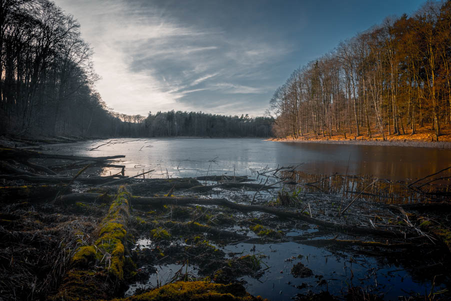 Shot against the sun creates a strong light.
Black
Black makes every color to glow and forms the maximum contrast to other colors. If I turn up the blacks or shadows in for example Adobe Lightroom, the visible colors become more present and of course the whole image becomes darker. But that is the point. Deep blacks and shadows maximize the radiance of colors.
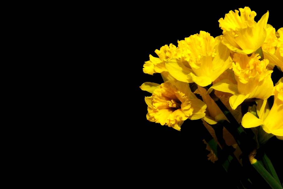 The yellow of these lilies wouldn’t be so intense without the black background.
Grey
Grey tones or neutrals are colors without any saturation and they are the shades of black and whites. The less the light the darker the grey is. A neutral grey works with any color and it is what is: it is not very present, it is the color without any characteristic.
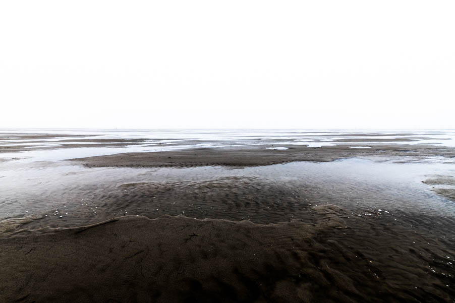 This is no black and white. It shows a foggy day at the beach.
Saturation
As already mentioned: grey is a color without color information. But there are also greys with shades of colors. A strong saturation is not everyone’s cup of tea. But children love strong colors and high contrasts. When you look at commercials for kids you will notice that. Anyway, it’s question of taste, for some it is very kitschy for others it is absolutely important that the sky has a deep blue.
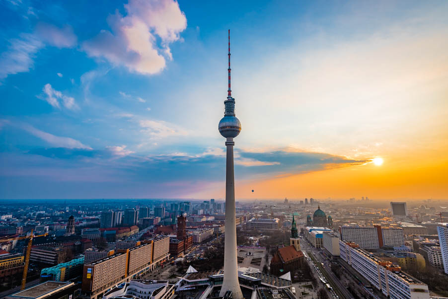 A strong saturation offer this picture.
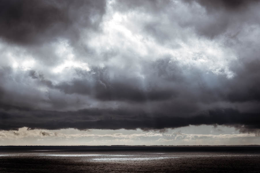 Photo with a lot of grey tones.
Concluding remarks
In digital photography colors can be changed easily even after they have been taken. Software like Lightroom and Photoshop can manipulate almost everything. And that is OK. Because the purpose is the most important. When I want to reproduce a sunset in front of a beautiful landscape I perhaps turn up a bit the yellows and oranges and add a deeper blue for a more dramatic impression. Because that is what I want. But I would not change the colors of the leaves on a tree, because they were not the colors which I wanted. That is to much manipulation for me.
So pay attention how the colors influence your composition and how they affect your picture or the viewer. There is also the possibility to edit the image in black and white if there are too many saturated colors. Maybe you try to focus on one color at your next shoot than on the subject. Or you try to find natural complementary colors in one frame. As always it is practice and your eye will getting better and better when you are aware of color as a mean of design.
If you are more interested for the topic monochromatic colors you should take a look on the article of the folks from Pixpa about monochromatic colors.
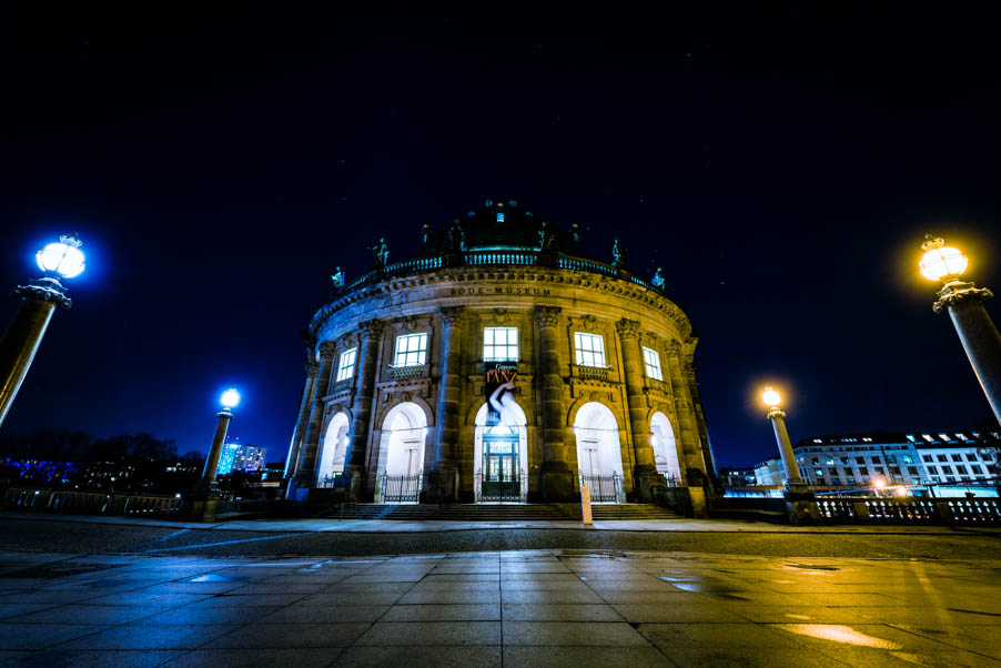 Blue versus Yellow.
Report
My comments